2.9%. That’s the average website conversion rate for healthcare organizations.
It sounds low, doesn’t it? That’s because it is. According to Unbounce’s Conversion Benchmark 2017 Report, the healthcare industry ranks among the lowest in website conversion, with 25% of organizations recording a rate lower than 1.4%.
One of the common issues with hospital and health system websites is that they’re just too complicated – overflowed with copy, or designed based on the organization’s business structure (by service line) rather than by the user’s mental construct (conditions and treatments). Often they lack clear, concise and relevant calls to action.
On the contrary is retail. Look at Amazon. How many of those smile-branded delivery boxes did you receive at your doorstep this holiday season? Amazon has figured out what escapes many healthcare organizations – they know how their customer’s make decisions, down to the detail – and they’ve built their site’s IA to help users quickly, easily and confidently make decisions.
The challenge is taking that “Amazon experience” of moving customers through a conversion funnel, and applying it to other industries, specifically healthcare. Today’s healthcare marketer can benefit by taking a page from the e-commerce playbook. With the rise of the digital patient and a consumerism based healthcare system – a strategic, conversion-focused website can help service lines (particularly those with elective procedures) elevate the bottom line.
Start by finding the Moments That Matter™ to your patients.
Being conversion-focused means being people-focused. Conversion funnels are different for different segments of your audience; it’s not a one-size fits all approach. Different personas have different values and differing needs (See: Using personas to develop targeted marketing messages). For example, a maternity patient may feel joy and excitement in their journey (when things are going well with the pregnancy). A cancer patient may be scared and experiencing a challenging life stage. Mental health patients often carry an unfair stigma associated with their disease. Bariatric patients sometimes take a much more transactional, consumerist approach. All patients are different. Understanding their unique decision-making processes is the foundation to designing a conversion funnel that truly helps them along their journey.
That makes research a critical step to identifying the Moments that Matter™:
 Ask your patients. Get to know your patients’ needs, emotions, and pitfalls in the decision-making process. One-on-one interviews, stakeholder interviews, and other qualitative research methodologies can be used to help organizations identify personas and map patient journeys.
- Ask your call center reps. When developing a conversion-focused site, don’t forget to examine the internal processes with your call-center teams (the “back-stage” in regards to service design). Where do they often run into pitfalls when helping prospective patients navigate the appointment-making process? Also, in what ways can the website be used as an online sales guide to help call center reps do their jobs?
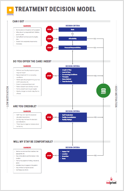
- Develop the decision-map. Use your research to inform and build a patient decision-map. This decision map will be the foundation for creating an online conversion funnel. Try to limit it to 5 steps – as the resulting conversion funnel must be manageable and achieveable for the user.
Then, Design for Real Life™.
Once you’ve developed the decision-map, it should be integrated into your websites IA, design and content. Below are some tips help transform the decision-map into conversions:
- Consider your landing point. By allowing a user to self-identify on the homepage (patient, loved one, provider), health systems can create a more personalized conversion-focused experience – with content that is empathetic and aligned to each user group.
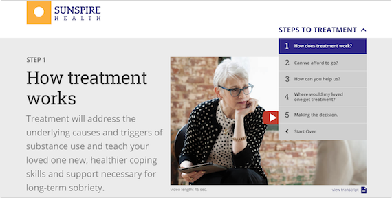
- Build a Conversion Funnel into the navigation. When a user begins the decision-making process on your site, consider stripping down the unnecessary design and IA elements to help them focus on the task. To do so, the site’s navigation should be paired down to align with the steps in the user’s decision-map (as discovered in the initial research).

Sunspire Health’s five ‘Steps to Treatment’: www.sunspirehealth.com
- Integrate Customized Calls to Action. Integrate chat software and customized phone numbers along the conversion funnel where possible. By creating unique call numbers for each step, you can later discover which steps to conversion are high-touch or more prone to fallout/abandonment.
- A/B Test. Use A/B and multivariate testing to test steps in the conversion funnel, messaging, and calls to action to optimize your results over time.
- Analyze your data. Just like shopping cart abandonment is a key metric in e-commerce, healthcare marketers should know where and why patients’ may exit a conversion funnel. Quantitative metrics can be coupled with further qualitative research for iterative improvements.
- Still, don’t forget SEO. A careful SEO strategy and proper site treatments should always be an integral part of your site design.
Integrating the above suggestions into a mobile-first design approach can help organizations take a conversion-focused approach to their website – bringing healthcare one step closer to that frictionless, Amazon-like customer experience.
