Nationally-Recognized Academic Medical Center
Bariatric Surgery Digital Experience Mapping
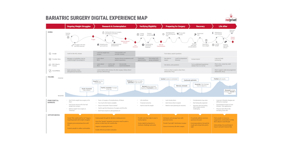
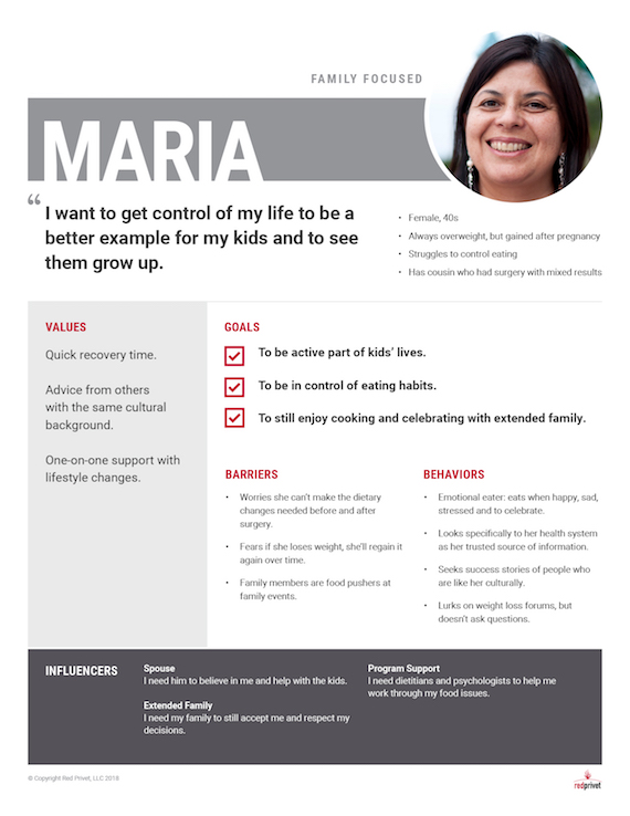
Particularly with elective procedures such as bariatric surgery, it’s valuable to understand the patient’s journey and factors that influence their decision making. That’s why Red Privet teamed up with a leading academic and health care system to build a digital experience map – coalescing information from interviews with real patients to create an engagement plan (for CRM marketing automation) and touchpoint messaging strategy to best engage bariatric surgery patients along the continuum of their decision-making funnel – from lead generation through retention. These consumer-driven insights served to improve the customer experience by enhancing the health system’s digital channels in a way that matched consumer needs and wants.
The journey mapping project was unique in that we took a focused and restricted view on digital acquisition – people contemplating weight loss surgery. To understand the full spectrum of the decision-making process, Red Privet conducted 1:1 interviews with individuals who were beginning to think about, just decided, and recently had bariatric surgery to gather a full contextual perspective. Focusing on digital, research participants demonstrated their online activity for each phase (i.e. search for “lap band”, etc.) and offered feedback about the helpfulness of various online materials. The highly contextual interview style also garnered specific insights on the health system’s existing site and recommendations to improve the overall experience.
In the end, keeping the project scope limited to digital properties allowed the findings to be specific enough to be implemented by the marketing team – while also demonstrating ways forthe health system to differentiate their service and position themselves as the provider of choice.
services
- Personas & Journey Maps
- Decision Maps
- Digital Experience Maps
- CRM and Messaging
The personas developed were powerful – providing great insight into prospective patients. Among other factors, research revealed that people wanted to be guided, walked through this process, and shown every step. The contextual nature of the research helped us recommend strategies to meet this goal.
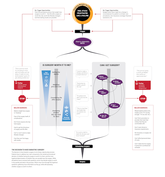
In addition to a digital experience map that included a proposed CRM and campaign messaging throughout the conversion funnel, Red Privet also created a decision map. This map highlighting the mental and emotional decision of whether surgery is important to them as well as the logistical determination of whether they can actually have the surgery and key factors that help them move through the funnel.
PSECU
Financial Services Website Redesign
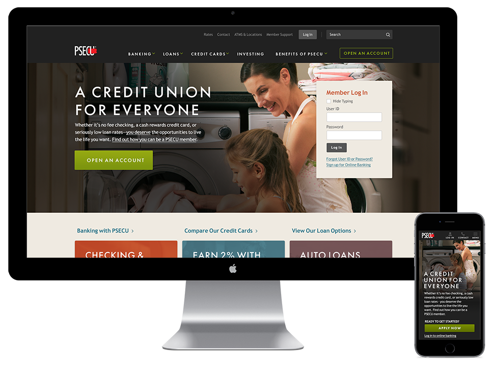
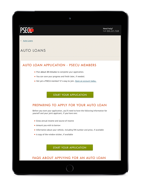
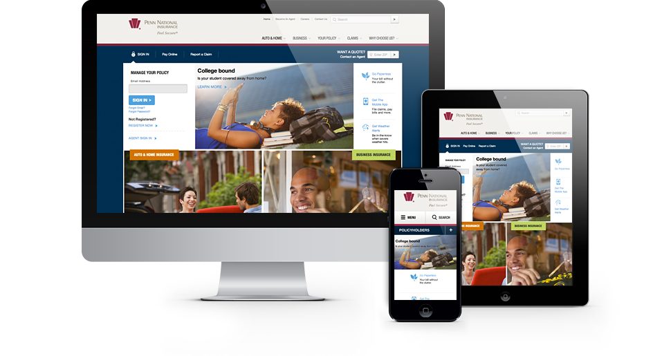
PSECU is a Pennsylvania-based credit union built around member needs. Being member-focused means delivering an optimal customer experience across all touchpoints, including digital. Red Privet worked with PSECU to envision, design and develop a new Sitecore-based consumer-facing website that not only improves the customer experience through strategic information architecture and content – but also allows PSECU a platform for greater content personalization, site accessibility and ultimately, increased conversion.
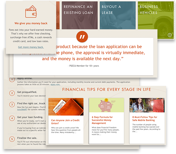
PSECU believes in “investing in members instead of a branch at every corner” – with a limited number of physical locations. This business model makes digital a focal point of the customer experience, with their consumer-facing website serving as a front door to a number of key online applications (such as applying for a mortgage, credit cards, online banking, etc.). As part of the website redesign, Red Privet worked with PSECU to envision and build new “App Prep Pages” to more seamlessly and effectively transition users from the informational consumer site to these action-focused online applications. Now, users have individualized paths that keep their context with specialized transition pages for mortgage applications, credit cards, etc. These “App Prep Pages” provide users with information on what they’ll need to complete their application (drivers license, etc.), how long it will take, and other pertinent information to prepare them to meet their goal. The result is a frictionless experience – leading to a greater likelihood of conversion.
Red Privet built the new, Sitecore site with a component-based approach allowing PSECU to make future updates more easily and include personalization components where desired. As customer experience continues to gain importance in the financial services industry, PSECU is well-positioned to exceed their goal of putting members needs first.
Our customer’s experience matters to us. Not only did Red Privet help us reimagine and re-platform our website to a more sophisticated Sitecore CMS, but their strategy and design work helped improve the ease and confidence in which consumers interact with and engage with our financial services product set.
PSECU’s new site extends the visual brand – with dramatic design improvements across all of their digital platforms, including responsive mobile and tablet views.

The “App Prep Pages” are designed to showcase the product a user is interested in. By limiting extraneous content and photos, dropping unnecessary navigational elements, and focusing on action-oriented content – these transition pages help the user prepare for the application pages and funnel them through toward conversion.
Red Privet created a sophisticated library of components / templates within Sitecore for PSECU – allowing their marketing managers to create and edit content and set up future personalization components without the reliance on developer resources.
Sunspire Health
Using Decision Maps to Maximize Online Conversions
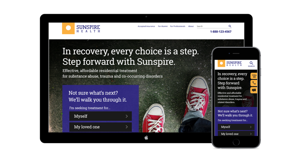
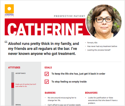
Sunspire is a national leader in patient-centric behavioral healthcare. And being patient-centric means improving the patient’s journey – from admission through treatment. Red Privet used a variety of research methodologies to better understand the patient decision model that leads to admission – ultimately helping Sunspire strategize, redesign and re-platform their website to improve the customer experience for those seeking care (and the call center advisors who help them).
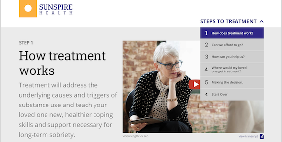
Sunspire’s call center serves a critical role in the patient’s journey, as prospective customers and referrers are required to speak to an advisor during admission. Through persona and journey mapping workshops, Red Privet worked closely with Sunspire’s call center employees to learn how that pivotal touchpoint affects both the customer experience and call center performance – ultimately building a step by step conversion funnel directly into the site’s navigation to simplify the decision-making process for users. Simultaneously, this also serves as an online sales guide for call center advisors.
The new, mobile-first Drupal website integrates chat software and customized phone numbers, building a supportive, customer-focused experience rich with marketing and conversion data to help continuously refine and improve the experience. The result is a frictionless experience that helps match customers to the most appropriate care programs while maximizing admissions for the organization.
services
- Information Architecture
- Content Strategy
- Personas & Journey Maps
- Experience Design
- Drupal Development
By understanding the steps our patients work through when seeking addiction treatment, Red Privet helped us deliver a website that catered to their needs. Ultimately, the site was designed to improve the admissions process – providing us with the ability to help more people.
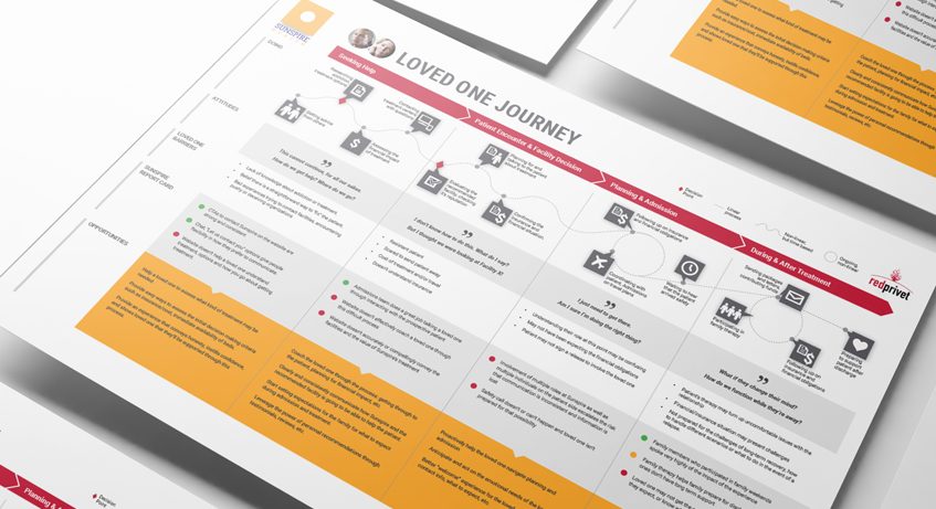
Our journey maps helped identify the unique needs of multiple audiences – including loved ones, patients, and referring providers. Having them self-identify on the website (via a “digital front door”) helps ensure a contextually relevant and tailored experience for the user.
Interviews with call center advisors provided critical insights into the online conversion process, while also informing persona development by serving as proxies for the recovering addict experience.
An online conversion funnel must be manageable and achievable for the user. Red Privet simplified the design to focus on the 5 key steps to conversion that were uncovered in the research. When a user begins that process, the navigation and other design elements get removed – and customized calls to action are added to each step of the 5-part conversion funnel. Within Drupal, Sunspire can use A/B testing and other methods to optimize conversion.
Sentara Health
Maternity Microsite
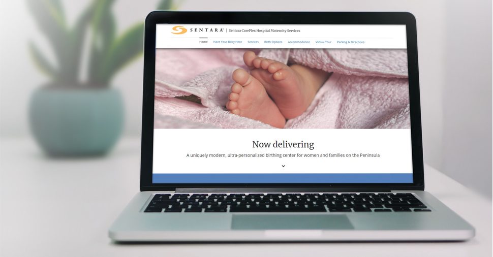
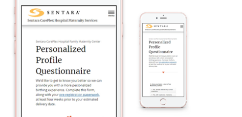
Sentara Health set out to develop a microsite to market a new suite of maternity services offered at their CarePlex Hospital location. Red Privet worked with Sentara to better understand what their customers expect from their maternity experience, ultimately using these insights to design a site that met their needs while differentiating Sentara’s new location as “uniquely modern and ultra-personalized”.
While customer research comes in many forms, Red Privet’s work with Sentara proved that even a minimal amount of customer research can go a long way in building a customer-first experience. Working with both internal stakeholders as well as a series of phone interviews with current and expectant mothers, Red Privet uncovered a set of preference variables that impact the overall customer experience. Included among them were technology options in rooms (Amazon Echo, etc.), music, services for fathers, and the overall values they look for when choosing a birthing destination. These variables were then included in a mobile-first Preference Form on the new site to help Sentara gather information to create uniquely personal experiences for each expectant mother. While the study was lightweight in nature – limited to two workshops over three days, the insights helped influence the site’s design and navigation including content, tone, visuals and architecture.
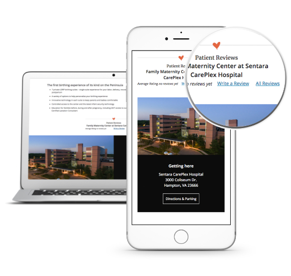
In the end, the new Sentara CarePlex Maternity site (Sentara Peninsula Moms) provides the information needed to help expectant mothers choose a place to deliver their child – with helpful online patient reviews and virtual tours weaved into the site design. Incorporating customer insights turned a basic brand destination to one that is tailored to moms’ needs in the local Hampton and Virginia beach demographic.
services
- Information Architecture
- Experience Design
- Personas & Journey Maps
Red Privet took a quick and iterative approach to research our customer needs – but the results were anything but ‘discount’. Our new customer-focused site lays the groundwork for greater personalization based on the data uncovered in our research.
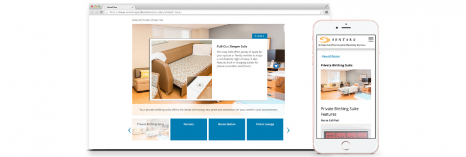
The Virtual Tour offers a visual representation (both wide-view and close-ups) of the Careplex Maternity Center and LDRP rooms. It meets the exploratory needs of a mother to see the environment in which she may have her baby, with the options to choose what to view based on what interested them rather than having to step through a set order or flow.
Red Privet used a mobile-first approach to implement an online form (via integration with FormStack) that allows mothers to submit their preferences to Careplex Maternity Center around a number of delivery accommodations – including music choices, dietary preferences, religious beliefs, and others. This allows Careplex to deliver a uniquely personalized experience for each family.
The new microsite incorporates a design component to pull in Google Reviews of the maternity center – allowing expectant mothers to review others’ experiences during the decision-making process, and new mothers an opportunity to share their feedback post-delivery.
Sentara Healthcare
Find a Provider Assessment

Find a Provider tools are an integral component to all health system websites, and organizations are becoming increasingly aware that the user experience can have a significant effect on patient acquisition and online conversions. Sentara Healthcare worked with Red Privet to discover opportunities to improve their site’s Find a Provider application to better match their customer’s needs – fostering a more positive connection and overall experience.
Red Privet recruited participants within Sentara’s demographic target market to participate in a usability study and subsequent interview – with each participant asked to complete pertinent online tasks such as submitting appointment requests or finding providers to treat pre-specified conditions. The emphasis of the study went beyond just the mechanical usability issues and assess how participants felt about the user experience.
The contextual inquiry study revealed a key theme: What people value in getting access to provider information changes depending on the context of care they’re seeking. Red Privet garnered a set of recommendations to improve the tool to better match the decision-making model of each persona – from using more flexible templates based on the complexity of care, to content and design suggestions that foster a more positive connection with users.
In the end, the study’s findings will enable Sentara to better connect with a customer based upon their unique journey to finding a provider by meeting the varying and often distinct needs for patients seeking complex care, routine care or otherwise.
services
- Contextual Inquiry
- Usability Testing
- Product Design
Red Privet’s research helped us discover how customer’s truly utilize our site’s Find a Provider tool, providing us with strategic ways to improve the application to not only maximize online appointment scheduling, but deliver a more useful and impactful experience.
The contextual interviews confirmed three key steps in a consumer’s conversion funnel: (1) Seek > (2) Decide > (3) Schedule. The Find a Provider application should follow this decision map.
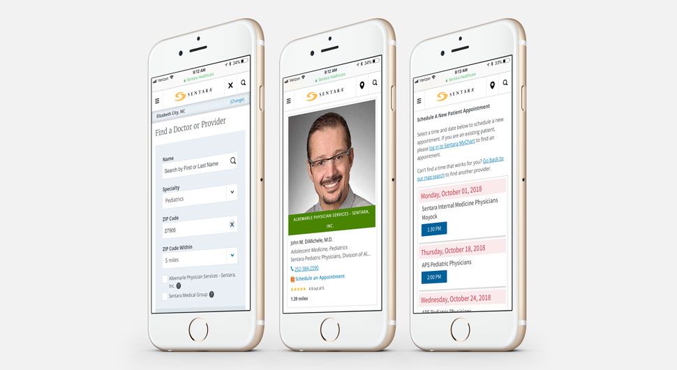
What people value in getting access to provider information changes depending on the context of the care they’re seeking. Those with a more complicated condition have a harder time making a connection with a provider through the online tool, and are less likely to convert online and more likely to call – making the multi-channel experience critical. Meanwhile, those with simpler conditions (such as a common cold) value more material factors such as conveience and access, while primary care looked for personal connections such as photos, “seeming nice”, where the provider went to school, etc.

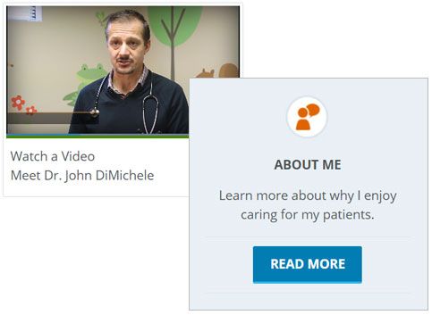
Content within find a doc templates should be written with the consumer in mind to build confidence in their search. For example, a provider’s published work on a topic should be described in more “layman’s terms” consistent with a consumer’s search, and with less clinical jargon. Video and other media selection offer ways for providers to describe their approach to medicine and experience in and easy to understand manner.
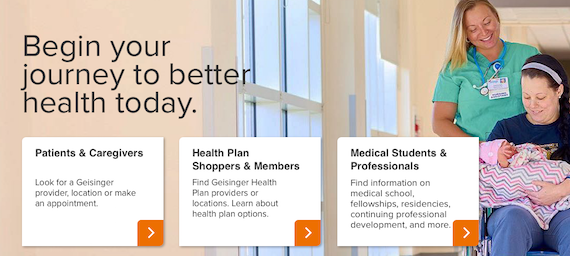
Geisinger’s Digital Front Door
Enterprise Website Design & Development
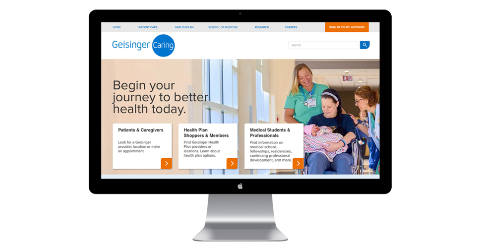
While integrated health systems like Geisinger are comprised of multiple business units with unique goals, customers generally see them as one brand entity. Therein lies a common challenge: to create a single, seamless digital customer experience while preserving the identity of their distinct business units. Red Privet worked with Geisinger to reimagine and reconceive their enterprise-wide web presence – unifying the four cornerstones of the health enterprise: their health system, health plan, School of Medicine, and research entities. Utilizing Sitecore’s leading marketing and customer experience platform, this rebuild of Geisinger’s web presence positions them to achieve key customer experience and business goals.
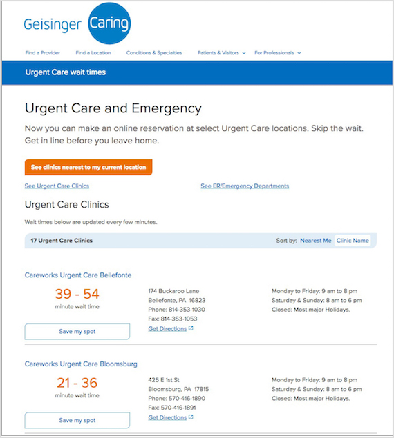
Change on this large a scale doesn’t just happen organically. Red Privet worked collaboratively with stakeholders across all four business units to help define a shared vision for a unified Geisinger website. The new web experience is highlighted by what’s been termed “the Digital Front Door” – a cohesive and frustration-free homepage presentation of Geisinger’s health system, health plan, education and research entities in a way that matches the user’s mental model of a singular brand. The site has consistent navigation, look and feel, clear pathways between web entities, and carefully integrates new technologies such as urgent care wait times. Red Privet’s team also leveraged Sitecore’s contextual marketing components to lay the foundation for incorporating dynamic and rule-based content personalization.
In addition to re-authoring web content, Red Privet created a design system of Sitecore page templates and a governance structure for content management. This allows organizational content owners the flexibility to prioritize their own content while ensuring that site components, content and style remains on brand. The end result is a new, scalable web and marketing platform that both enriches the customer experience and drives business results.
services
- Information Architecture
- Content Strategy
- Experience Design
- Sitecore Development
 2017 W3 Award:
Health Care Services for Websites
Integrating four business units, all while moving to a new Sitecore platform can be overwhelming. It wasn’t for Red Privet. Their team took a strategic and collaborative approach to help us envision, design and build a revolutionized digital experience for our community.
Red Privet’s design and development helped pave the way for marketing automation. For example, this could include taxonomy-based personalization via dynamically displayed content cards (such as news, blogs, and local health events) based on the user’s geography or site behavior. Such automation will help Geisinger deliver more effective campaigns – while their end-users benefit from a contextually relevant web experience.
Red Privet simplified the user experience by designing a “Digital Front Door” within the homepage hero – giving users a clear and intuitive pathway to health system, health plan, and education content. This design visually integrates the business units while giving users a quick path to their desired destination.
As part of this project, Red Privet conducted a thorough vendor evaluation for Find-a-Provider tools. Additionally, new functionality was seamlessly integrated into the site design – including tools such as Find-a-Study for clinical trials and location-based urgent care wait times (and appointment reservations). Now, patients can more efficiently make healthcare decisions – finding the right care, in the right place, at the right time.
Combining separate entities under one web umbrella requires a constant “big picture” view to ensure design consistency and scalability. The new design system not only supplied the necessary web components (or building blocks) for the health system entities, but also supports expansion as Geisinger acquires new hospitals (Holy Spirit) and medical schools (Commonwealth Medical College), and seeks to hire 1,500 clinical staff.

Penn State Health
Medical Center Site Redesign
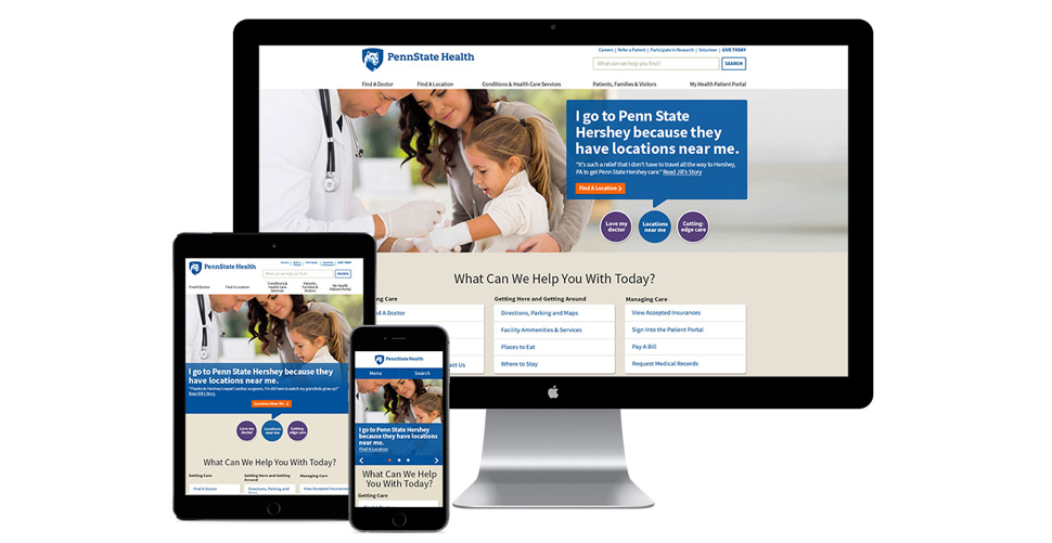
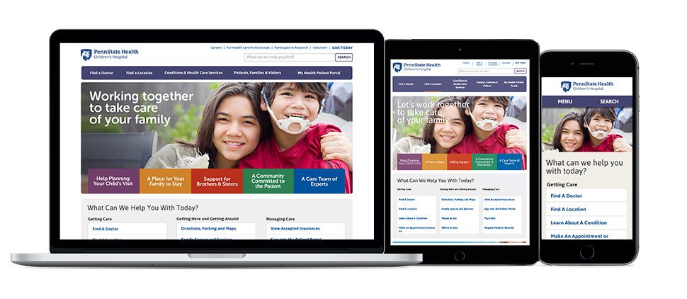
Penn State Health is a patient-centric organization – and they wanted their website to reflect that. That’s why they teamed up with Red Privet to first research how and why patients visited their website, and then design and develop an improved experience that helped patients effectively and efficiently achieve their online goals.
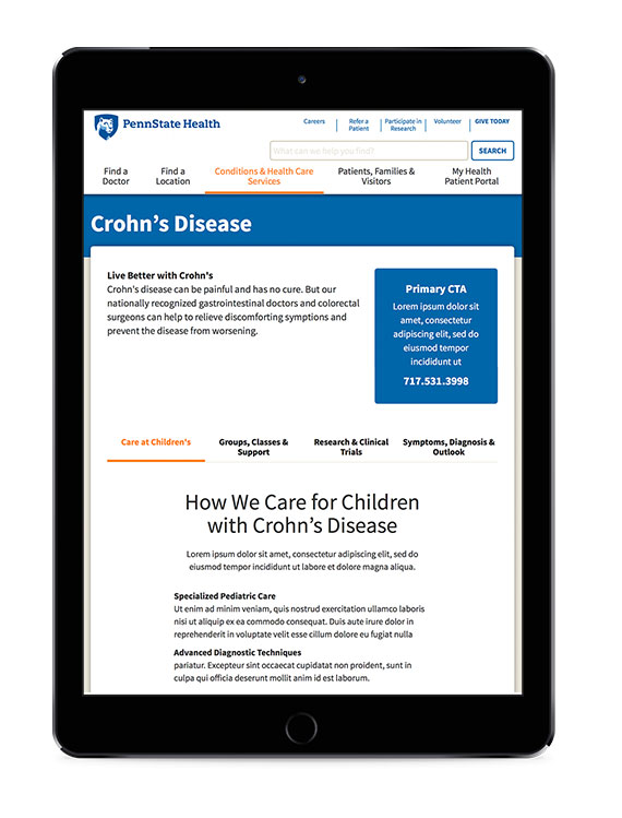
Red Privet’s redesign goal was simple: focus on patient needs. In addition to homepage and navigation enhancements aimed to provide patients with clear pathways to top tasks (such as accessing the secure portal, finding a doc, or planning a visit), Red Privet also created new “Condition Hubs”. Initial journey mapping research revealed that patients often approached the idea of finding care by researching their condition. While Penn State Health has a lot to offer – including support groups, clinical condition information, clinical studies, publications, and access to top-notch providers, the information was disconnected and dispersed across various site pages. Red Privet’s redesign helped patients to “connect the dots” by pulling all of the relevant information they need to coordinate their care into one convenient location. These “Condition Hubs” represented a shift in thinking from what was a department-based site architecture to one that is condition-based.
Penn State’s new medical center site provides patients with a more intuitive and less stressful experience that aligns with their health information-seeking behavior– shifting the burden of consolidating health management or condition-specific information away from the patient and on to the website itself.
services
- Journey Mapping
- Content Strategy
- Website Redesign
- Development
 2017 eHealthcare Leadership Award:
Best Site Design
We appreciated Red Privet’s strategic approach. Their research-based design was both high-quality and patient-centric, helping us deliver a more impactful customer experience. I would not hesitate to use them again.
Penn State Health’s navigation and homepage previously focused on a variety of audiences including patients, researchers, and students, among others. The redesign honed in on patients and their primary needs. For example, recognizing that most patients visit the site a specific task, Red Privet created a “What Can We Help You With Today” homepage section to offer users a clearer, more intuitive experience.
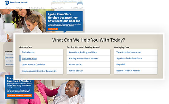
Prior to the redesign, patients with certain conditions had to search across multiple department pages to “hunt and gather” their desired information. Now, new “Condition Hubs” consolidate all pertinent condition-related information into one space. Condition hubs were created for a variety of conditions including Crohns disease.
Geisinger’s ProvenExperience
Mobile Application Design
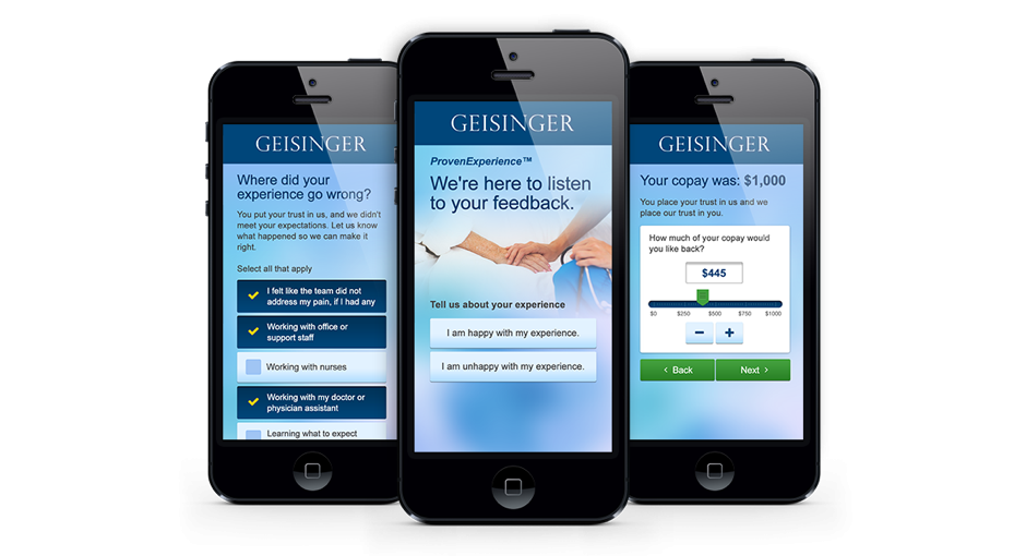
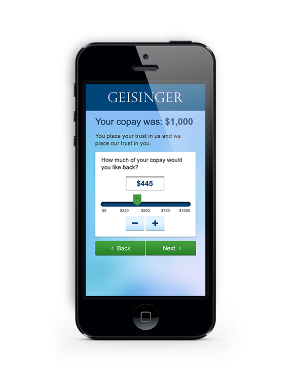
Geisinger’s nationally-recognized ProvenExperience program offers patients an opportunity to provide feedback on their experience and request a full out-of-pocket refund if dissatisfied for any reason — even a poor experience in the waiting room. Red Privet was tasked with creating the mobile app design for this ‘first-of-its kind’ healthcare program. To do so, Red Privet applied key patient insights to build an app that processed refund requests in the greater context of feedback – ultimately helping Geisinger uncover opportunities to improve their patient’s experience.
Refunds are a radical new concept in healthcare. That’s why it was important to take an iterative approach to the app design, gathering user feedback from real patients along the way. Using intercept surveys in patient waiting rooms to test the app’s content and architecture in the context of a real healthcare experience, Red Privet gained insights that ultimately helped make the app feel less transactional in nature. The design focused on making refund requests clear, with verbiage geared toward providing an all-encompassing, compassionate patient experience measurement tool. The mobile app’s tone, interactions, features and functions were built with this goal in mind.
In the end, the ProvenExperience app provides a valuable complement to Geisinger’s groundbreaking program. It gives both satisfied and dissatisfied patients a voice in the healthcare experience and an opportunity to submit feedback, providing critical insights to help mold and improve Geisinger’s patient experience.
services
- Experience Design
- Mobile User Interface Design
- Visual & Creative Direction
- Usability Testing
2017 eHealthcare Leadership Award:
Best Mobile App
 2016 Web Marketing Association Mobile Web Award:
Best Healthcare Mobile Application
 2016 Horizon Interactive Award:
Mobile Apps - Business
We engaged Red Privet because of their focus on user-centered design. It was critical that the app was intuitive from the patient's perspective and reflected how the patient prefers to give feedback. Red Privet helped us go straight to the source.
Concept testing revealed that patients appreciated the opportunity to provide feedback. The app provides a check box list of potential patient experience pitfalls – prompting the patient to classify where expectations went unmet. This allows Geisinger to classify areas for improvement.

Red Privet tested a variety of scenarios to determine the best way to offer refunds (percentage, total dollar amount, etc.) based on the patient’s preference. The interaction (e.g. slide tool), wording, and placement of the screens were also tested with patients to ensure that the process felt natural and less transactional.
Penn State Hershey Medical Center & College of Medicine
Customer Journey Mapping
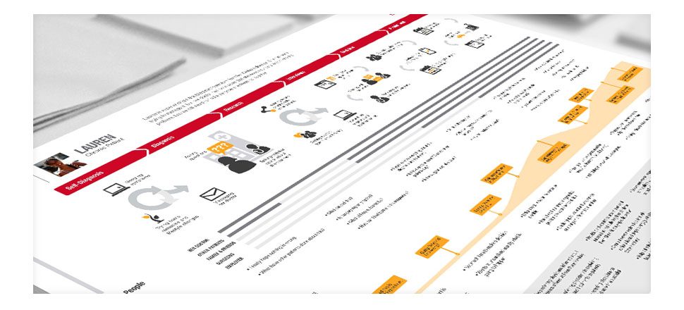
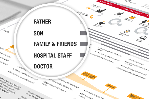
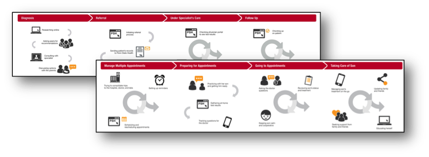
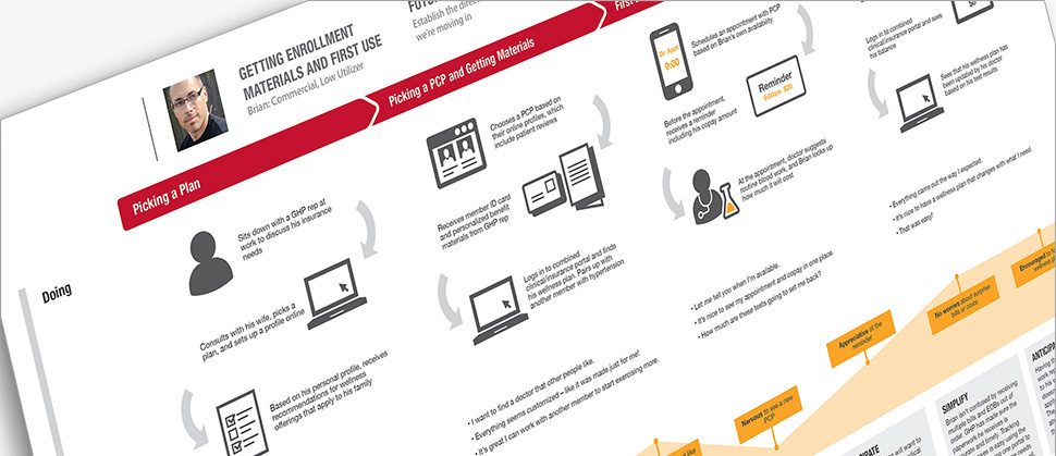
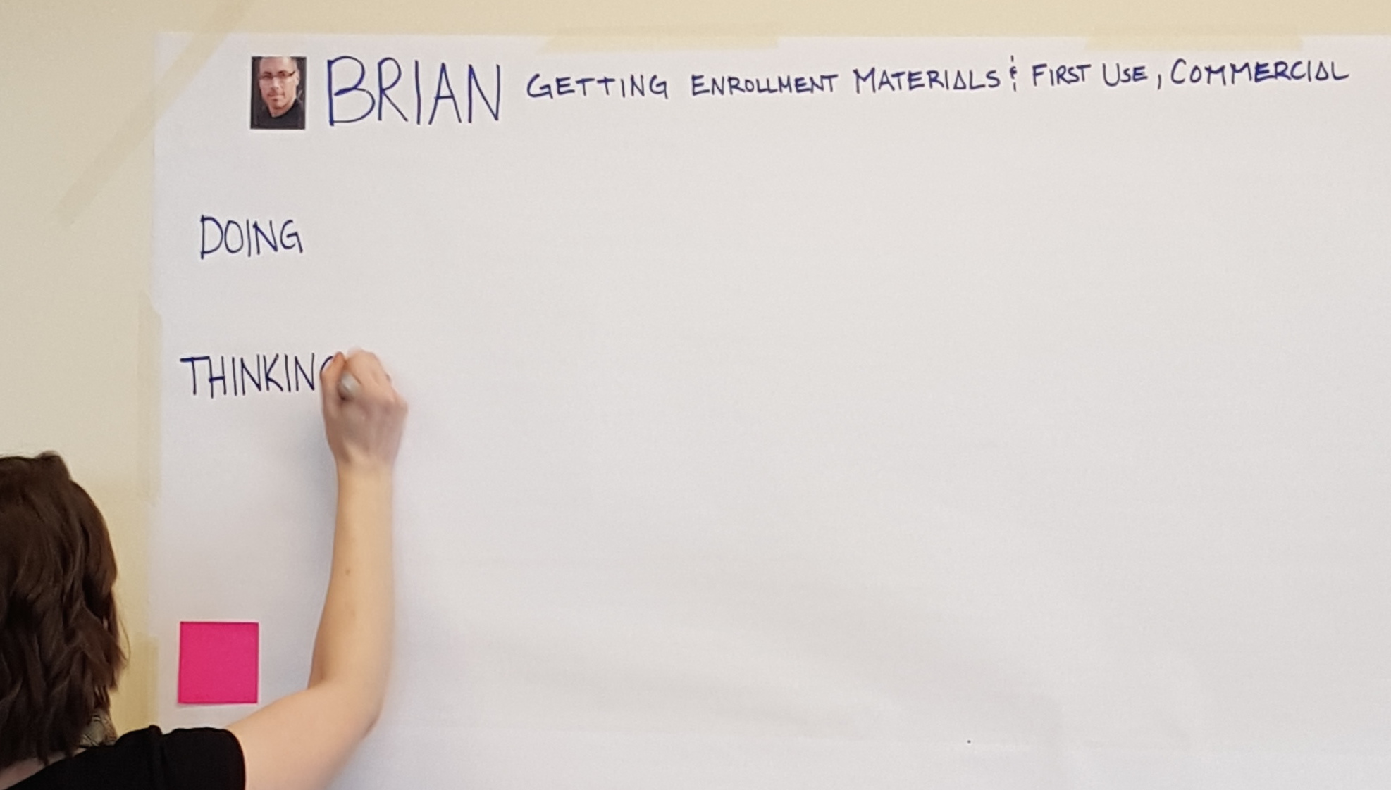
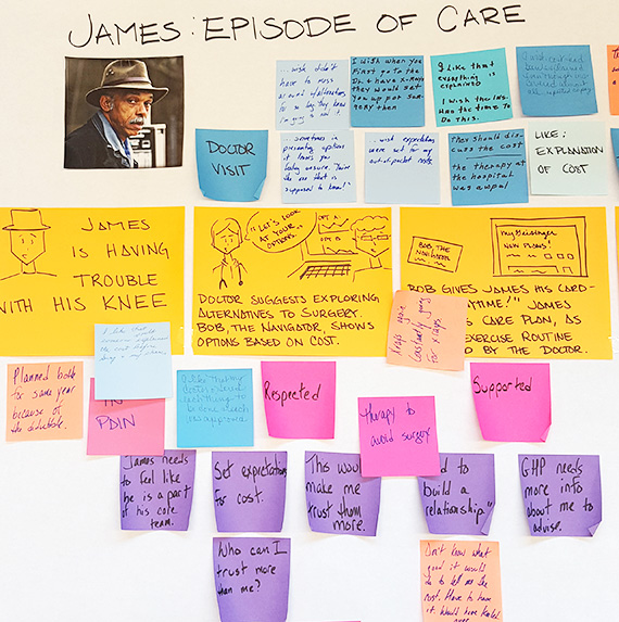
Penn State Hershey Medical Center & College of Medicine had a challenge similar to many healthcare organizations –to create an empathetic, cohesive digital customer experience by offering the right tools – websites, portals, and health apps – at the right point in the customer journey. Red Privet created journey maps to help Penn State Hershey identify the Moments that Matter to their customers – uncovering key pain points along the journey and opportunities where meaningful engagement can occur.
Red Privet took a unique, holistic approach to journey mapping, extending the focus beyond the typical insights of a customer’s action, thinking and feelings, to include an additional variable – “people”. Healthcare is often a shared experience. Caregivers, family members, friends, church members, and employers may all factor into the journey at various touch points. Combined with patient insights, learning about these people and their influence provided a critical 360-degree view into the customer experience.
In the end, customer journey maps helped connect the dots for Penn State – advising a digital strategy that will provide it’s patients, referring providers and med students (and their “people”) with the information they need, when they need it in their journey.
services
- Journey Mapping
- Customer Research
“Red Privet uncovered unique insights into our customer’s shared decision-making process and mindset. Their journey maps will ultimately help us to deliver an even more impactful digital customer experience.”
The research highlighted what we call the real social network— people with key roles in the customer’s journey, including when and how they influenced the overall experience.
Individual journey maps told distinct stories for distinct customer personas (i.e. patients, caregivers, researchers).
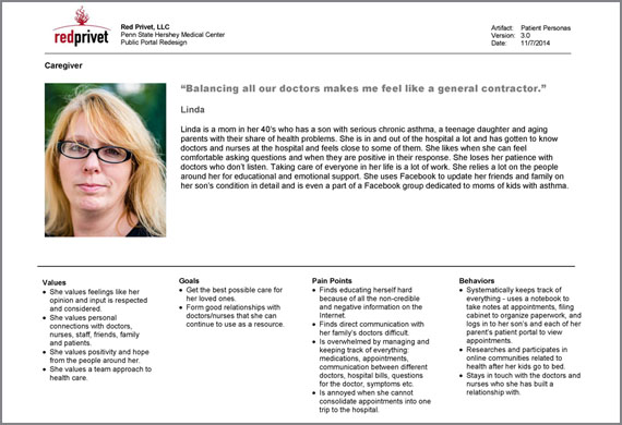
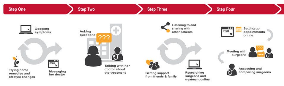
For example, one journey map demonstrated the pivotal steps in a patient’s journey, the actions involved in each step, and their emotions along the way. There were seven unique journey maps developed. This immersive research helped inform empathetic design strategies aimed to make the whole experience better.
Penn State Health
Children's Hospital Website Redesign
22When designing a website for a children’s specialty hospital, the focus should be on making the experience better for caregivers – as it’s usually a highly emotional and stressful time. Red Privet helped Penn State Health create a new Children’s Hospital site to support parents’ needs in direct, yet empathetic way while also catering to the expectations of a second audience – referring providers.
One unique challenge when designing a Children’s Hospital website is that the patient is almost never the site’s audience. Because getting care for your child can be one of life’s most emotional decisions, our research indicated we needed to speak directly, honestly, and positively to caregivers. Red Privet’s redesign focused on aiding parents and caregivers during this stressful time through carefully crafted IA, content strategy and design that gave users a clear understanding of “what to expect”, “what to do”, “where to park”, and other specific needs discovered by interviewing actual parents.
As the only Level 1 pediatric trauma center between Philadelphia and Pittsburgh, referring physicians were also a primary audience. It was important providers’ needs were addressed directly and succinctly. This included providing them with key talking points for their conversations with patients, and a prominently featured 24-hour, toll-free 800 number for efficiency in follow-up questions.
In the end, Penn State’s redesigned Children’s Hospital website serves as a true resource for both parents and referring providers, catering to their needs in all aspects – from content to design.
services
- Ethnography
- Information Architecture
- Content Strategy
- Website Design
- Responsive Websites
2017 eHealthcare Leadership Awards:
Best Internet Homepage
Best Mobile Site
2016 Horizon Interactive Award:
Websites - Health / Human Services
Red Privet’s research helped us uncover parents’ needs with regards to our Children’s Hospital website. Their web design, content strategy and development work delivered precisely on those needs.
To best identify with these differing audiences, journey mapping was employed to better understand the care continuum for both mothers and referring physicians. Through this analysis, insights into each audience’s unique journey yielded appropriate strategies, messages, and tactics realized.
By building empathy with the parents, our researchers were able to learn that they valued imagery that offered reassurance. Our photo guidelines helped guide Penn State Health in a direction that supports these needs by using photography that showed their providers connecting with kids, replacing the ‘butterflies and dinosaurs’ typically seen on Children’s Hospital sites.

Through iterative research on the information architecture of the Patients, Families, and Visitors section of the site, Red Privet uncovered users’ top tasks and behaviors. These insights informed a design that helps users effectively and efficiently navigate the site to achieve their online goals.

Geisinger Health Plan
Online Explanation of Benefits
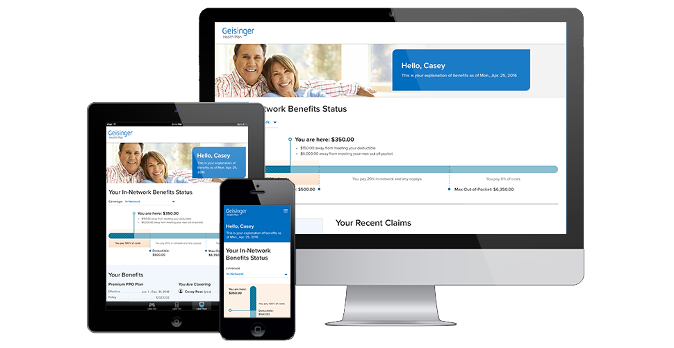
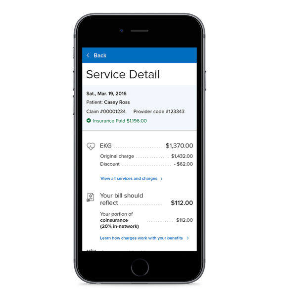
Understanding health insurance can be challenging. That’s why one of the leading health insurers, Geisinger Health Plan, turned to Red Privet to help its members better comprehend how claims were being processed, why they owed what they owed, and the subsequent affect on their overall benefit status. Red Privet met this challenge by designing a new screen to communicate the information typically delivered in an Explanation of Benefits (EOB), but in a consumer-friendly way.
Based on information revealed during Red Privet’s work on Geisinger Health Plan’s customer experience strategy, members were generally unsure about the purpose of the EOB, resulting in a high volume of customer service calls, confusion, frustration, and a negative overall impact to the organization’s net promoter score. Through an iterative design approach that applied feedback from real members and stakeholders alike, Red Privet created a mobile-first design that enhanced members’ comprehension of the EOB through the use of visual presentation and plain language. This approach was instrumental in identifying an intuitive information architecture that matched the user’s mental model and helped them actually recognize why the claim was paid or not paid.
In the end, Geisinger Health Plan achieved their goal of taking a complex topic such as insurance and making the information less burdensome to understand and less intimidating to deal with. The results: increased consumer confidence, less phone calls, and happier members.
services
- Customer Research
- Information Architecture
- Experience Design
- Responsive Design
 2016 Horizon Interactive Award:
Websites - Responsive / Mobile Design
2016 Horizon Interactive Award:
Websites - Consumer Information
Red Privet truly helped our members understand how their insurance benefits work. Their solution was thoughtful, well-executed and intuitive, but most importantly member-centric.
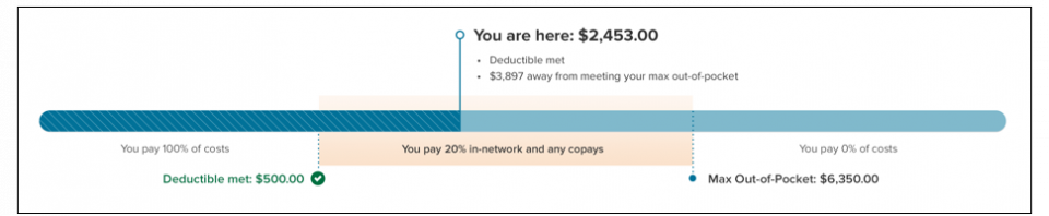
Red Privet deployed a true iterative design process by creating four design “sprints” to test complex scenarios with members and stakeholders. Member feedback revealed the importance of using plain language (minimizing insurance jargon), graphics that have a clear purpose, and keeping color at a minimum to reduce information noise and confusion. Showing deductible information as a calculation aided with comprehension.
The online EOB was designed mobile-first to optimize mobile display before scaling for tablet and desktop. By hiding information complexity with design, user confidence increased and users expressed a desire to use the web-based EOB.
Geisinger Health Plan
Member Experience Strategy & Journey Mapping
In the Affordable Care Act era where consumer choice reigns, customer experience is a top priority for health insurers. Geisinger Health Plan, who serves over 540,000 members, worked with Red Privet to improve their customer experience strategy by discovering what is most important to their members – with the ultimate goal to increase member satisfaction, retention, and loyalty while improving their net promoter score.
Red Privet worked directly with members via one-on-one interviews and interactive journey mapping workshops to provide Geisinger Health Plan insights into what their members were actually experiencing. After revealing key pain points around strategic priorities (such as enrollment, questioning a bill, etc.) during a first round of customer journey mapping, Red Privet worked cooperatively with members to brainstorm a strategy to address member challenges and improve customer experience. “Future” state customer journey maps were then developed based on these solutions and market-tested with a new set of members.
The end result was not only a series of journey maps that told the true, uncut story of Geisinger Health Plan’s member experience, but also a transformational, member-centric business strategy built from real insights – including an actionable and prioritized roadmap of opportunities for member experience improvements.
services
- Personas & Archetypes
- Journey Mapping
- Business Strategy
We appreciated Red Privet’s strategic approach. As a result of this project, we have a better understanding of our members’ challenges and an actionable plan to enhance our customer’s experience.
Red Privet used a series of 24 one-one interviews with commercial and Medicaid members to develop key personas for journey mapping. Then, two new groups of members participated in interactive customer journey mapping workshops to help map these personas through both “current-state” (to uncover pain points) and “future-state” (to test proposed solutions) scenarios. Employees were included in both workshops.
The materials from our brainstorming sessions helped Geisinger Health Plan stakeholders understand first-hand how their members experience the brand through real stories and real feelings as told by members themselves.
To help Geisinger Health Plan communicate the vision for their future state member experience to all employees, Red Privet created an animated explainer video that encapsulates the kind of relationship the plan wants to build with their members. Only about three minutes, the video paints the picture of the organization’s vision in a simple, sharable format. Watch a short clip from the full three minute video.

Penn State College of Medicine
Website Redesign
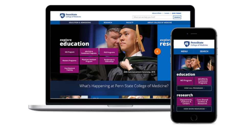
Applying to medical school is a unique process, different from typical four-year undergraduate programs. That’s why when redesigning Penn State College of Medicine’s website, Red Privet turned to medical students to better learn the role of the web in the application and matriculation process. These insights informed a human-centered website design, founded on real customer-insights.
Through contextual interviews, Red Privet discovered that prospective students spend extremely limited time on a school’s website when first deciding to apply. The website becomes most valuable as a research tool during the secondary portion of the application – where schools ask specific questions via an essay-format, and the third portion – the interview. At that point, applicants desire quick information to assist them with answering questions and to “shop” schools to see if it’s the right fit for them. To meet this unique challenge, Red Privet’s redesign focused less on curriculum-heavy content and more on visuals to highlight the program’s key features in a consolidated, but informative way. The new site also incorporated campus lifestyle photography, student quotes, academic data and blogs to tell the story of what it was truly like to be a Penn State College of Medicine student.
The end result was an improved site that told a carefully crafted story of Penn State College of Medicine – but in the condensed, convenient and actionable format desired by applicants.
services
- Contextual Interviews
- Human-Centered Design
- Responsive Design
2016 Web Marketing Association Mobile Web Award:
Best Education Mobile Website
 2016 Horizon Interactive Award:
Websites - School / University
2016 Horizon Interactive Award:
Websites - Responsive / Mobile Design
Our redesigned College of Medicine website is catered to prospective students - with a clear navigation, and concise and actionable content. Red Privet did a great job uncovering users' top needs and designing a solution that is helpful to applicants.
College of Medicine sites generally have a lot of overlap between medicine, research, and nursing information. However, medical students expressed the desire to “jump right into” program-specific content, rather than a blended content experience. To do so, navigation elements were added to the hero image to minimize clicking and scrolling – making it quicker and more intuitive for students to get to their area of academic interest.
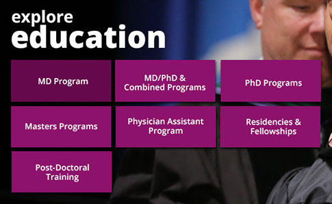
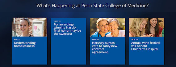
Visual consolidation of content was a design focus. Red Privet created a “What’s Happening” feature that applied consistently to each department landing page (research, medicine, etc.) so prospectus students can get a quick snapshot of pertinent information.
Research revealed that once students are accepted, they often turn to the website to get excited about the program and “see themselves there”. To assist, the new site featured lifestyle photography that included real students (as opposed to just buildings), foreshadowed common careers by degree type, and gave increased prominence to a student-led blog that provided an inside view of “what it’s like” to be a Penn State College of Medicine student.

United Concordia Dental
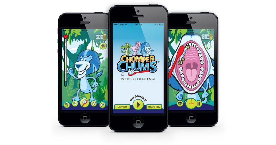
Chomper Chums® Oral Hygiene App for Children
United Concordia Dental was looking to increase their dental insurance sales and promote brand awareness using their mobile strategy. Since most customers only visit the dentist twice per year, the challenge Red Privet faced was finding a way to make United Concordia a frequent presence in its customer’s lives beyond just their normal annual visits to the dentist.
To do this, Red Privet determined that targeting kids with a creative mobile app focused on daily dental hygiene was the best way to market United Concordia’s services and brand to its customers.
The Chomper Chums® provides children ages 4-11 with a game-based approach to learning the proper technique for brushing, flossing, and rinsing.
Chomper Chums® not only makes brush time easier on parents, it also provides an opportunity for United Concordia to promote itself as a brand each time Chomper Chums® is used.
services
- Human-centered Design
- Usability and Evaluation
- Web and Mobile Development
 2013 Pittsburgh Technology Council Data Awards:
Best App & Information Architecture Award

Red Privet usability tested the application with target-age children. From this we identified what aspects of the game were clear enough for the child and also received parental feedback.
Love it! My kids ages 11, 9, and 5 love this app. Great job!!!
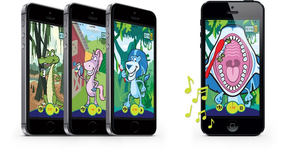
Children are able to select from three characters (a lion, a horse, or an alligator). Chomper Chums can brush away sugar bugs, floss, or rinse and each activity within the game uses animation, a timer, and music to engage the child.
Provides parents with an interactive and fun app that makes brushing fun for their children and promotes good dental hygiene.
Reward animations provide “pay-offs” for consistent behavior reinforcement.

With the help of Red Privet, we created Chomper Chums®, a mobile app designed to make brush time easier on parents while innovatively promoting dental hygiene in kids and integrating our brand into our customers’ daily lives.
Penn National Insurance
Digital Experience Strategy
Penn National Insurance has a tremendous level of satisfaction with its agents and policyholders. But as new generations fill the customer ranks, the expectations for digital engagement and services was becoming increasingly difficult to plan for and navigate.
Red Privet met with Penn National stakeholders to identify key business strategies and objectives. We then employed both qualitative and quantitative studies to gain insights into agent and policyholder attitudes and values. The strategy looked across all digital channels from social platforms to portals to mobile.
Penn National now has a plan for leveraging each digital channel to its optimal use in supporting their Feel Secure® brand. Most importantly, there is executive-level alignment on the vision for the future digital experience.
services
- Customer Experience Strategy
- Customer Research
- Human-centered Design
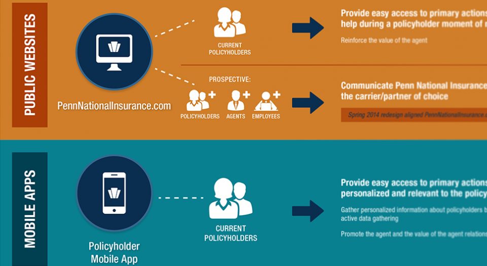
A digital channel matrix was created to illustrate the optimal use for each channel.
Working with Red Privet has helped us focus and prioritize our digital opportunities. Building alignment on such an important effort wasn’t easy, but the Red Privet team listened to all the differing perspectives to craft our digital strategy. We look forward to working with them on future initiatives.
Research findings were at times complex. This grid demonstrates how a single finding could apply to multiple channels.
It also shows how one channel can address multiple findings.
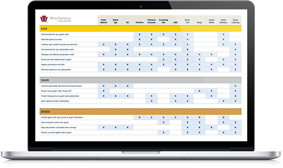
At times, less obvious approaches emerged as being the most appropriate based on the research and business analysis.
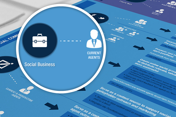
Social business applications trumped traditional social media as it presented a unique opportunity to engage and dialogue with business partners.
Members 1st
Online Banking Self-Service Portal
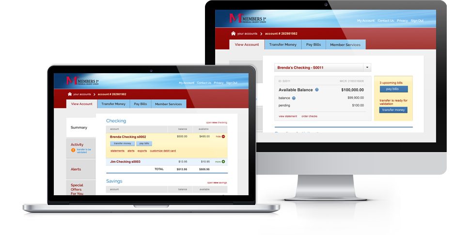
Many credit unions pride themselves on the level of customer service they can provide members. Members 1st’s online banking had become antiquated, yet an average online member was still accessing his or her account eleven times per week.
As more members were moving to mobile banking, it was clear a redesign was needed to both optimize the site for mobile and generally improve the site usability.
Red Privet partnered with Member’s 1st’s development team to bring their online banking to a simple-to-use and responsive web solution.
The result was a completely revised online banking experience with increased member satisfaction and use.
services
- Customer Research
- Human-centered Design
- Usability and Evaluation
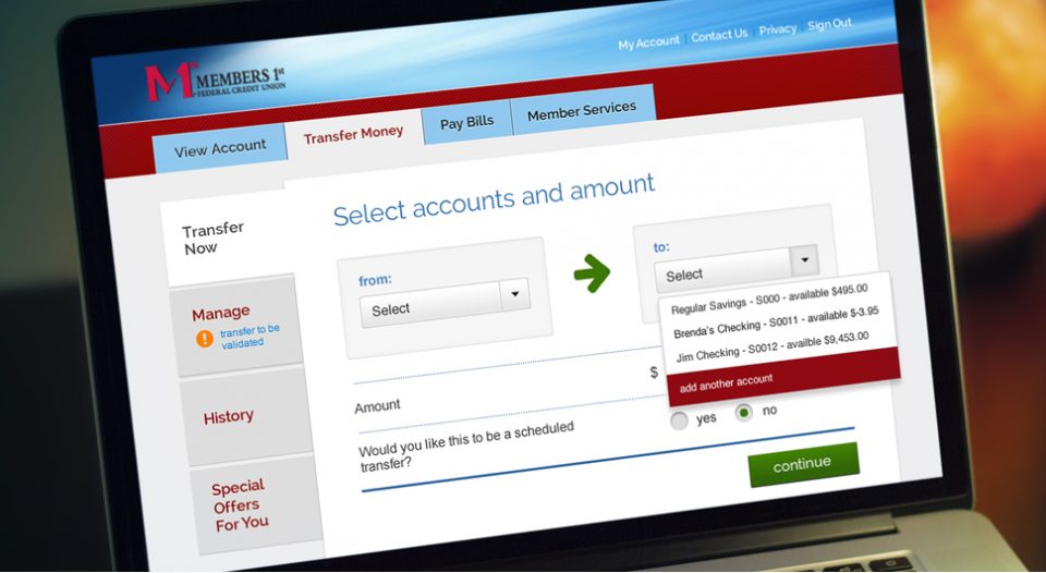
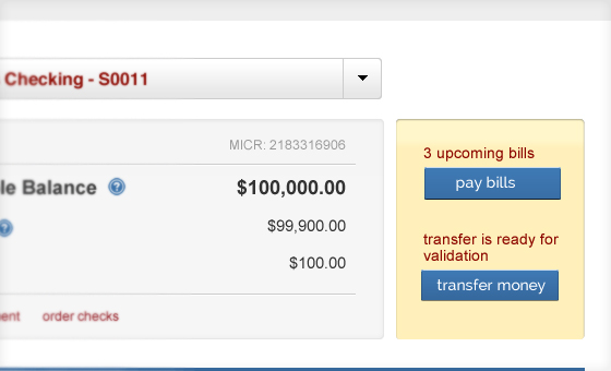
Three fund transfer processes had completely different and often confusing experiences. Red Privet mapped the process and normalized them in to an easy, guided experience that keeps members confident.
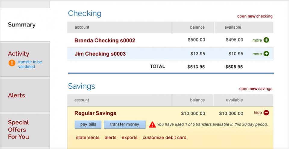
Account Summary gives members quick visibility into all their finances including checking, savings, lines of credit, and installment loans.
Alerts keep tasks and reminders top of mind for members.
Clear feedback keeps members confident everything is working as it should.
CorpU
User Experience Design
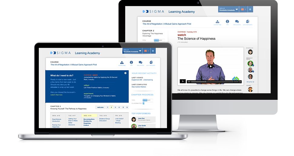
The CorpU platform brings a unique, collaborative learning approach to corporate training and development. Their Guided Learning Journey promotes social, collaborative, and paced blended learning experience for corporate leaders regardless of their geographic location.
While the business-relevant content was rich and informative, busy corporate leaders struggled staying oriented and motivated given their fragmented schedules.
Red Privet worked with CorpU to create designs that made it easy for busy professionals to engage in virtual learning to solve business problems. The second
generation of the user experience incorporated elements to motivate engagement, interaction within teams, and overall learning outcomes.
With a redesigned experience and improved usability, leaders demonstrate higher level of engagement with the content and each other. This is driving a higher level of effectiveness and satisfaction—a winning combination!
services
- Customer Research
- Human-centered Design
- Usability and Evaluation
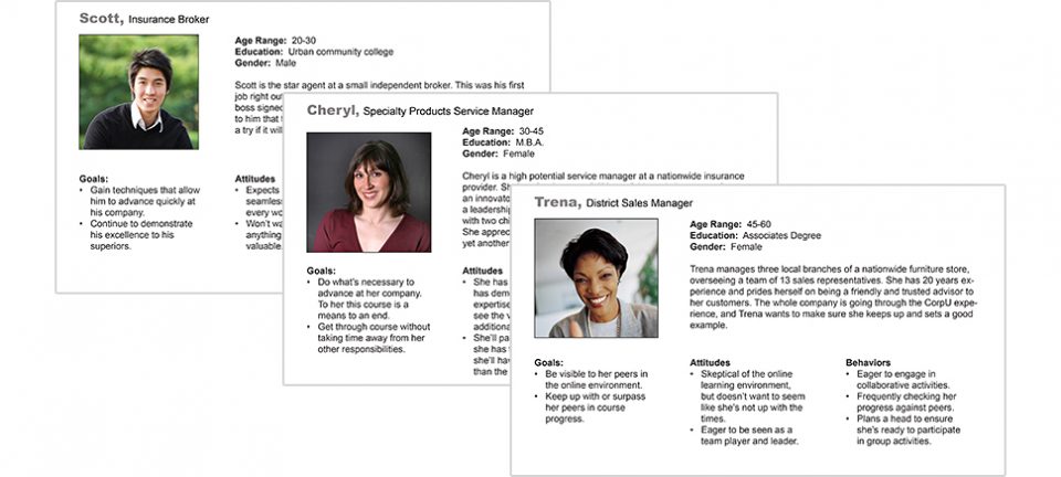
Leader personas helped the team keep the users at the center of the design process. Understanding their challenges in using the product was instrumental in crafting a winning solution.
We’ve been receiving great customer feedback since implementing the design changes. That’s backed up by our analytics that show greater engagement and course completion.
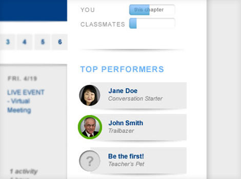
Indicators of individual progress against the class provide the motivation these competitive leaders need to stay up-to-date with the course plan.
Avatars called “chat heads” make the class personal and social regardless of geographic location.
The course calendar helps leaders jump right back in where they leave off.
Alerts, statuses, and time-to-completion estimates help them assess how to best make progress with their limited time.
Gannett Fleming
Responsive Corporate Website
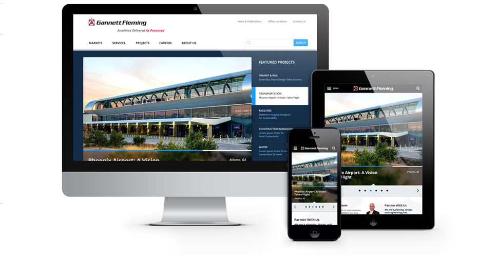
Gannett Fleming is a diverse engineering company growing both domestically and internationally. To date, Gannett Fleming has presented its ever-evolving service capabilities to prospective customers largely by its internal structure.
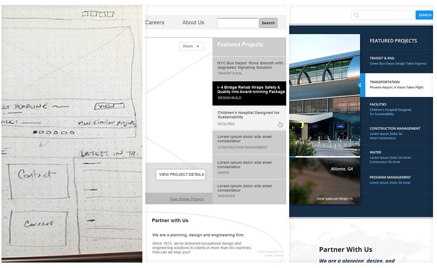
Red Privet devised a content strategy to present information by both markets served and services provided. The restructured information architecture supports separate paths based on the visitor’s intent and perspective-one that makes more sense to prospective customers and employees.
The new design better demonstrates what Gannett Fleming can do through its project work. With a new lA, better information seeking patterns, and an international-friendly design, Gannett Fleming is ready to engineer the world.
services
- Customer Research
- Human-centered Design
- Usability and Evaluation
- Web and Mobile Development
Customer research and iterative design helped ensure the design was just right. Key tasks were usability tested so Gannett Fleming could be confident with the results.
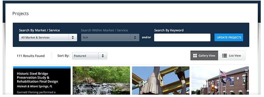
Putting projects first put Gannett Fleming's work, not their internal structure, in the forefront. Easy filtering allows visitors to find information most relevant to them.
A carefully designed mobile menu makes moving through four levels of content a simple, straightforward experience.
The menu stays oriented to the active page even when it’s closed so the visitor always knows where they are.
As a visitor navigates into the site each previous selection remains visible building a path that allows the visitor to easily move between content levels.
Listrak
Listrak 5.0 Portal
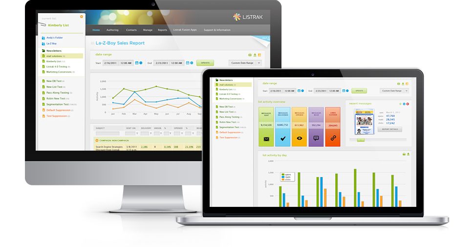
Listrak offers strategic email marketing solutions from acquisition and customer re-engagement to the most advanced shopping cart abandonment remarketing solution on the market.
However, conversations with Listrak’s customers revealed a problem and an opportunity: a lack of visualization of data through charts and graphs.
Red Privet designers and Listrak developers worked closely to build a dashboard view of email campaign performance, featuring intuitive graphs and charts.
Listrak 5.0 has been a huge success, continuing to capture market share and growing Listrak as an industry-leading solution.
services
- Customer Research
- Human-centered Design
- Usability and Evaluation
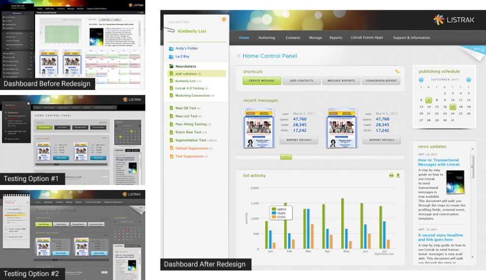
Improved data visualization and overall design went through iterations that included preference testing with Listrak customers. While both Red Privet and Listrak liked a more playful design, customers indicated that managing online marketing isn’t “fun.” This led to a compelling, yet more professional final design.
Our challenge was the visual component. The design just didn’t reflect the powerful features Listrak offers. Our product simply didn’t look as good as it works.
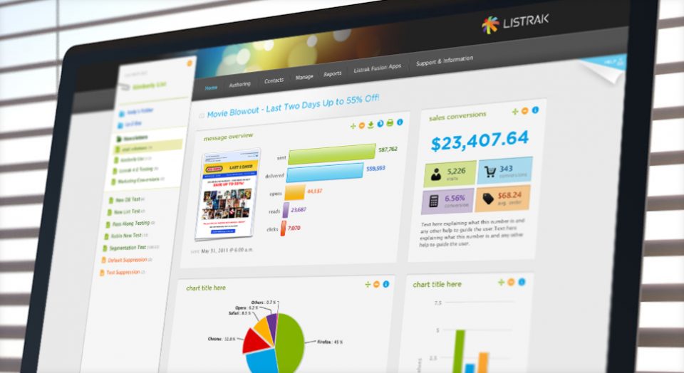
Red Privet set out to create a visual design that captures the power and sophistication of Listrak’s features, yet is pleasurable and easy to use. The team also used JQuery library elements, such as panel animation and tooltips, to provide a more dynamic, friendly experience.
We feel Red Privet delivered a strong design that reflects both what Listrak can do and where we are heading from a branding and technical standpoint.
Janet Weis Children’s Hospital
Moving4Health – Childhood Obesity Prevention
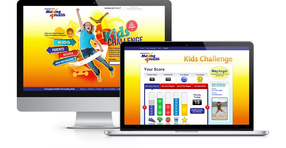
The Janet Weis Children’s hospital had received a grant from Kohl’sCares® to combat childhood obesity. However, ideas for an educational website, while rich in information, seemed counter to solving the obesity problem largely blamed on sugared drinks and too much “screen” time.
Red Privet recognized that it would take more than information to change undesired habits in early adolescents. Working with members of the pediatrics team, Moving4Health focused on turning healthy lifestyle decisions from information to action.
The Moving4Health Kids Challenge program is delivered through an in-class, school setting and motivates children to log choices in an online journal. The contest design also provides health tips and daily challenges that encourage adults and children to work together on improving healthy decision-making for the entire family.
services
- Customer Experience Strategy
- Customer Research
- Human-centered Design
- Usability and Evaluation
- Web and Mobile Development
I just showed the Kids Challenge to a 10-year-old patient who is not very excited about what he has to do to lose weight. He LOVED it! I asked him to log in every day for 2 weeks...he asked if he could use it for even longer.
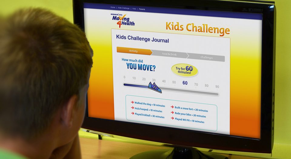
Nurses working with obese early adolescents reported higher success rates with Moving4Health. The program limits screen time to a few minutes so children can play actively rather than on the computer.
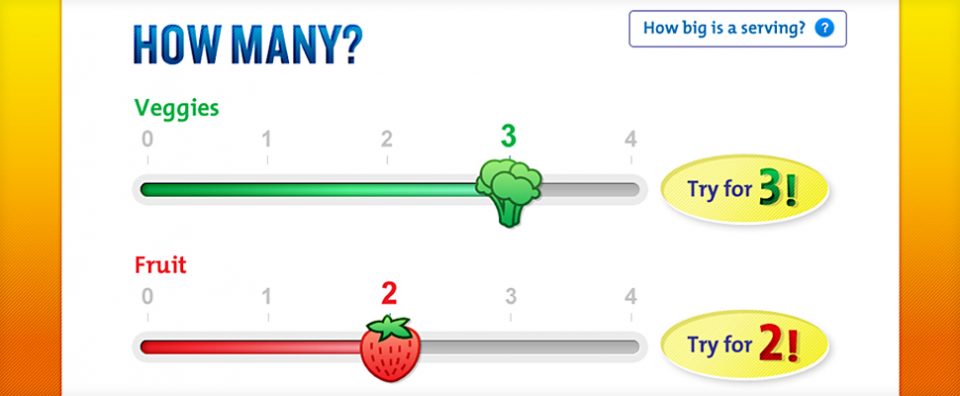
Children visit the site to record their daily food and drink consumption as well as their activity. These quick visits motivate kids to make incremental behavior change, but doesn’t keep them glued to a computer.
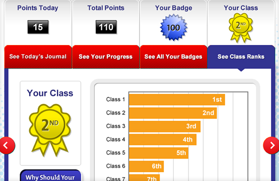
Children can compete with themselves by earning points and badges on their personal scorecard.
For more motivation, children can also see how their class’ standings compare to their classmates.
Thank you all for doing such a terrific job. Red Privet is an outstanding company that does outstanding work. I wish you all the best success. I look forward to working with you again soon!
Geisinger Health System
Clinical Procedure Preparation App
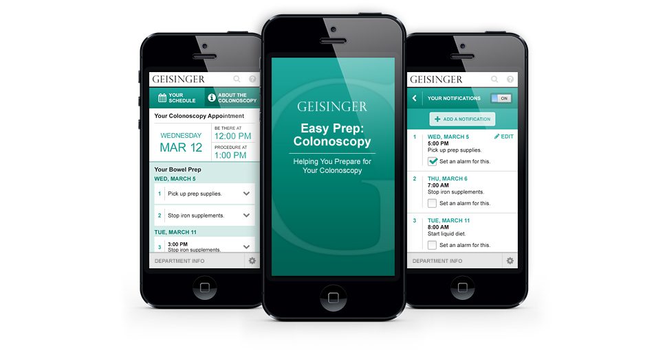
Geisinger Health System is nationally known for their evidence-based approach to care. However, sometimes, despite best education efforts, patients failed to follow the proper preparation protocols before a procedure. This meant rescheduling the procedure, but even worse, requiring the patient to reschedule and repeat an often unpleasant preparation.
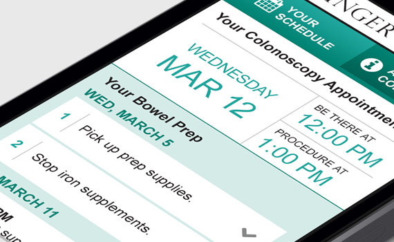
Red Privet worked with Geisinger patients and clinicians to better understand the problem. A simple mobile app was designed to support patients when preparing for complex medical procedures. This patient support tool provides alerts and just-in-time support (including multi-media) to reduce anxiety and promote a successful outcome.
Now Geisinger patients have the information at their fingertips, right when they need it!
services
- Customer Experience Strategy
- Customer Research
- Human-centered Design
 2015 Horizon Interactive Awards:
Mobile Apps - Business
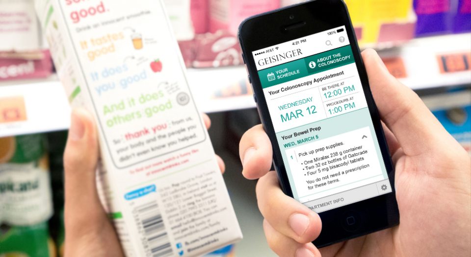
When over-the-counter products or other pharmacy items are needed, the app reminds you to buy them and offers a convenient shopping list.
That [kind of app] would be really cool! I would have taken that to the store with me when I had to shop for the prep supplies.
The patient is prompted to enter the date and time of their appointment.
The app alerts the patient each time they are ready for the next preparation step.
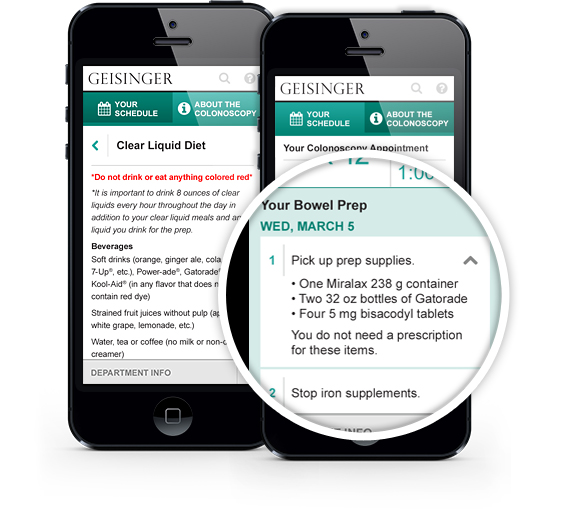
Information previously listed in dense paragraphs is chunked to provide just what’s needed – at the moment of need.
Where appropriate, graphics and other media replace the text.
The original brochure content is also available to provide an introductory overview.
Red Privet brought a skilled and professional team and produced high quality deliverables. They absolutely demonstrated that they have expertise in user-centered design. I would not hesitate to use them again.
HM Insurance Group
Responsive Website and Portals
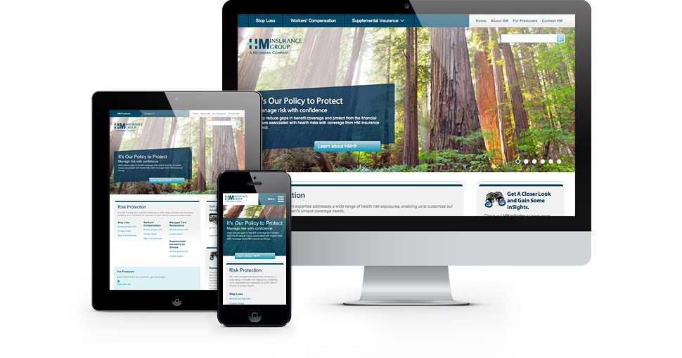
HM Insurance Group is a rising insurance star offering Workers’ Compensation, Stop Loss, and other Supplemental products.
Like many business-to-business firms, HMIG’s independent producers were about to experience a generational change where up-and-coming Gen X & Gen Y producers were looking for access on the go.
To get out in front of where its business is heading, HMIG engaged Red Privet to redesign both their public website and their eServices portal as responsive sites.
The result? HMIG’s award winning design is welcoming new and current producers and customers with an experience they not only desire, but expect.
services
- Human-centered Design
- Usability and Evaluation
- Web and Mobile Development
 2013 Web Marketing Association WebAward:
Outstanding Achievement in Web Design
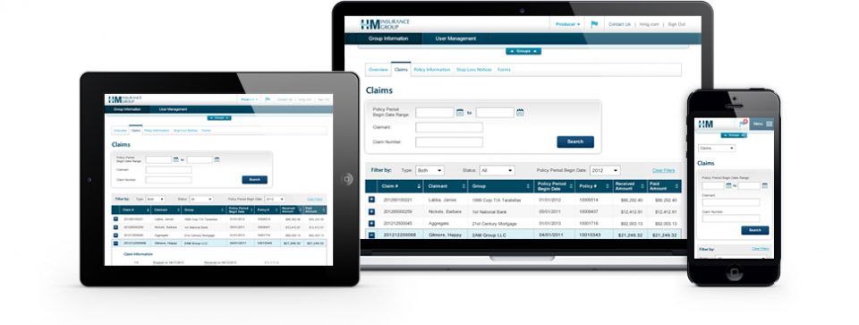
Red Privet’s research revealed that Account Managers, who go onsite with clients to provide training and complete claim forms, would gain efficiency with tablet access.
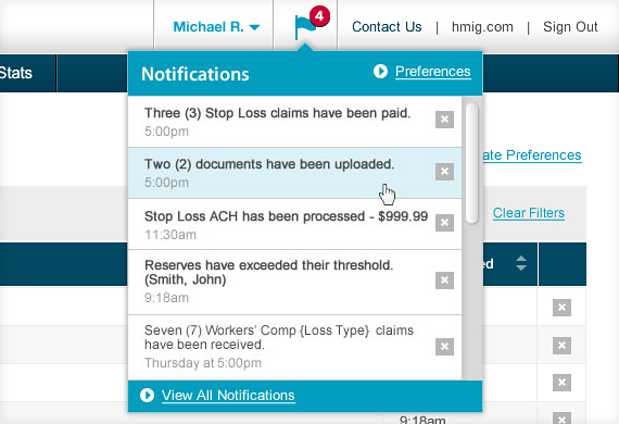
Real time notifications give producers just the right amount of information to take action and at the right time.
Configuration allows the producer to filter notifications to the groups and topics they want to track.
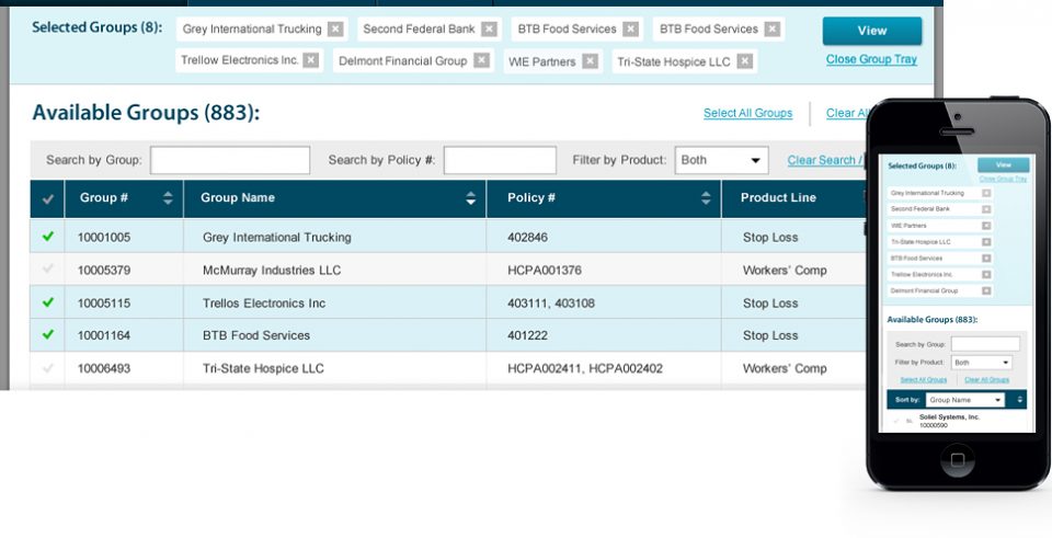
The eServices portal provided responsive design challenges including data filtering and varying tabular data views. Differing design patterns were created to keep the information accessible and usable regardless of the device being used.