People are turning to connected mobile devices more than ever to perform online tasks. According to Forrester Research, 91% of US adults access the Internet on a smartphone at least once per week.[1] This includes your potential customers. And, they aren’t just checking email or the latest headlines.
Your potential customers evaluate what it’s like to do business with you from their first interaction with your brand. Often, this first interaction is with your website on a smartphone or tablet. Your mobile web experience should reflect the customer experience of doing business with you. Is yours seamless, simple, and straightforward or frustrating and confusing?
As part of a redesign of a client’s corporate website, we recently crafted a responsive navigation experience to reflect the high level of service our client provides its customers.
Design for a Painless Experience
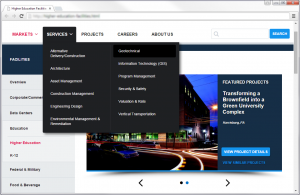 The responsive navigation takes advantage of available real estate at larger resolutions, remaining visible so users can see the service offering at a glance.
People often describe bad experiences as “painful.” As part of our research-based design approach, we identified potential painpoints and designed the experience to mitigate them.
Our client offers a broad swath of professional services that can be very specialized in some areas and is continuously evolving. In addition, the services are offered across diverse global markets. We understood from our research that potential customers need to understand what services are offered in “their” market and in “their” location, so helping them establish relevance to “their” situation was incredibly important.
By looking at current site analytics, we also learned that visitors often enter the site through keyword searches on the firm’s specialized services. These niche services necessitated several levels of content, so users are often starting deeper in the site, not at the homepage. Having a contextual navigation that maintains where they are was essential, as was organizing and presenting information in a findable, scalable way.
Achieve a Seamless Experience
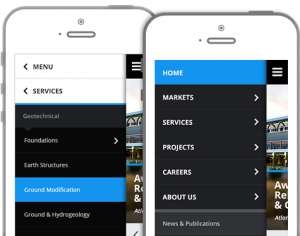 Mobile users easily switch between content levels and always know where they are.
To have a valuable experience, visitors need to easily make connections between related services and markets and have a clear orientation within the site. Our responsive navigation solution makes moving through four levels of content simple and straightforward.
We optimized the experience at different resolutions. At larger resolutions, users easily see paths to view information first by Service or by Market, supporting the different ways in which various audiences want to find information. The submenus under Services and Markets are maintained on the screen to enable visitors to quickly navigate within the section, rather than requiring users to repeatedly reopen the menu, as many responsive sites require.
At smaller resolutions targeted for mobile use, users access the menu from the left by selecting the menu icon or swiping. The menu maintains context of where the visitor is so they stay oriented. As they travel deeper into the site, their previous selection is maintained at the top of the menu pane, essentially building a breadcrumb that allows them to easily move between content levels.
Demonstrate “Responsiveness” in Your Customer Experience
Your responsive navigation is just one of many interactions that make up your customers’ experience with your brand. However, through careful attention to your responsive navigation as part of an overall digital strategy, you can ensure your potential customers have a positive experience that gives them confidence, which you can translate into a successful business partnership.
What does your responsive navigation say about your customer experience?
[1] Source: Forrester’s North American Consumer Technographics® Online Benchmark Survey (Part 1), 2014